
this is Taylour Paige, the star of VH1's new hit series, "Hit The Floor". neither of us is really big into tv, but last week I got drawn into watching (and getting a kick out of) "Love & Hip-Hop Atlanta" with our mom and sister. before I knew it, "Love & Hip-Hop" had gone off and I had made myself comfortable in the love seat. up next was this show filled with an interesting storyline, drama, & beautiful scantily clad women, so of course I had to peep it out just to see what it was about. Taylour plays one of the main characters who's face was everywhere in the episode I watched and though I'm not a tv-head, I'll definitely be tuning in to watch "Hit The Floor" again.

Three Feelings
Sooo the website is pretty much done! It's hard to put into words those feelings you have when something that's been in your head & heart for so long, finally makes itself visible for everyone to see. For us, three feelings follow when awesomeness like this happens.
The first feeling is "hype-ness". Seeing one thing pop off is fuel for us to get something else done.
The second feeling is "gratefulness". We're über thankful to God, simply for Him being who He is, and also for the amazing, talented, ambitious people that He's surrounded us with to help us, for us to help them, and for all of us to ultimately get done what He wants to get done.
The third feeling is "humility". Reaching a milestone like this reminds us that there's no ultimate destination on this journey. We appreciate every success and see every experience as a set-up for what's to come.
The site officially launches on Monday, April 22. G E T R E A D Y!
ATTB

Bianca Jagger, in her heyday.

Beautiful day.
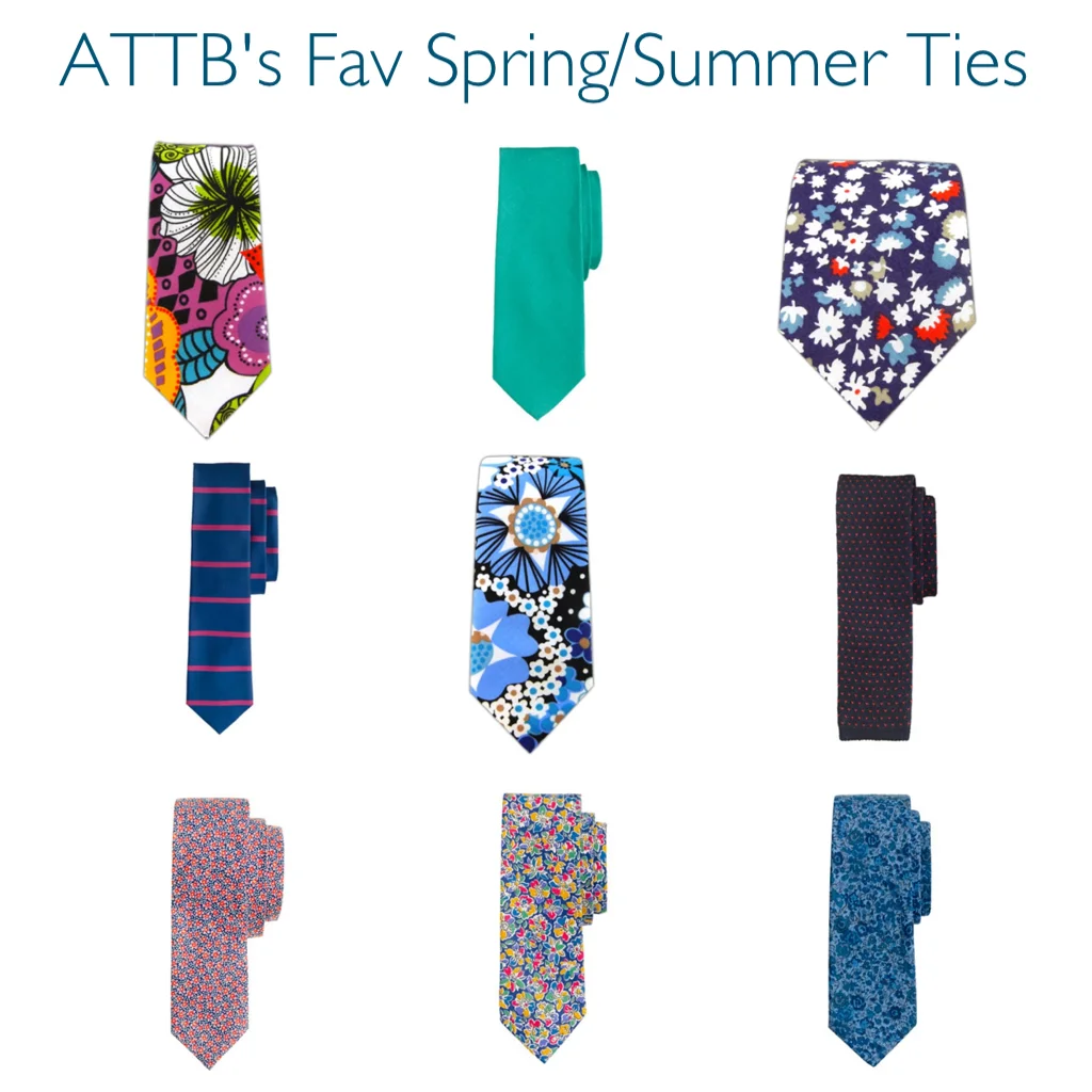
Dope Ties.


We wanted to let y’all in on the creative process behind our latest ‘loveNYC’ graphic and how it came to be! At stage ONE, we (Thurman & Torrence), along w/ our homie & partner John Paul, kinda shot in the dark with a few ideas. We used the N.Y. Knicks’ current logo as a reference and we did what we could to work the “LOVE” in there some kinda way. Stage TWO is where the diamond-heart idea was birthed. Hearts are pretty common & easily associated with “love”, so we wanted to keep that easy association while choosing to deter to something less conventional than a regular, average heart. We also preferred the “diamond-heart” because it is more symbolic in that it embodies strength, beauty, toughness, & love all into one symbol. The top design in stage TWO was our favorite, especially Torrence’s, until JP had the idea of putting the “NYC” on the inside of the diamond-heart. That turned out to be a great idea! Thurman free-handed that idea at the bottom of stage TWO and a more defined version of it can be seen in stage THREE. By stage THREE, we had a nice design that was equally clean and meaningful. What usually happens in our creative process, whether pertaining to design or music, we like to seek the opinions of some of our friends and loved ones to see what they think. Once we got the feedback we desired for this design, we then knew it was time to turn to the amazing Gabi Ferrara! One of the many reasons we love working with her is that she always does an awesome job with mixing her own creative taste with ours. On this design, we decided to use the Tungsten font for “NYC” because it’s a clean, sharp, & simple type. The color scheme for this design is the same as the one previous because we sought to keep some uniformity in the graphics throughout this ‘loveNYC’ campaign. We sent Gabi what you see in stage THREE and she transformed it into the finished product, what you see in stage FOUR!
We’ve got some new sweatshirts coming SOON, so if you didn’t get one of the last ones, here’s your opportunity to get your hands on one & support the cause! We’ll let y’all know when they’re available for purchase.